The right* way to plot: gridspec
* It really is ...
PyCoffee @ Vitacura - 7 April 2016 - fvogt@eso.org
premise:
- matplotlib is the one-stop shop for all 2-D plotting in Python. Easy to make rapid plots & tons of examples.
- But at times frustrating to get beautiful & complex plots:
- subplots locations, sizes, ratios
- colorbar location, size, width, alignment
- labels outside plotting window
- layout updates
- ...
gridspec:
- a simple, elegant, quick and essential way to handle multiple plotting areas in Python/matplotlib
- http://matplotlib.org/users/gridspec.html
utility:
- essential for complex subplots
- extremely useful for plots with colorbars
- great (and good practice) for ANY plot
cost:
- 2 lines +
- 1 sub-module import
gain:
- total control over the plot
- accuracy
- elegance
- infinite powers
- ...
take-home message :
- $\texttt{plt.subplot(2,1,1)}$ $\leftarrow$ **NEVER EVER AGAIN !**
- $\texttt{plt.colorbar()}$ $\leftarrow$ **NEVER EVER AGAIN !**
B) Set the stage: import the required modules
In [1]:
import numpy as np # For creating some fake data

# Use some notebook magic - forget the next line in normal scripted code
%pylab

import matplotlib.pyplot as plt # Gives access to basic plotting functions

import matplotlib.gridspec as gridspec # GRIDSPEC !

from matplotlib.colorbar import Colorbar # For dealing with Colorbars the proper way - TBD in a separate PyCoffee ?
C) Create some fake datasets to play with ...
In [2]:
# Ok, let us start by creating some fake data
x = np.random.randn(1000)
y = np.random.randn(1000)
z = np.sqrt(x**2+y**2)

# `randn` generates an array of shape ``(d0, d1, ..., dn)``, filled
# with random floats sampled from a univariate "normal" (Gaussian)
# distribution of mean 0 and variance 1.
D-1) Get started with the plotting
In [3]:
# First, create the figure
plt.close(1)
fig = plt.figure(1, figsize=(15,8))

fig.show()
In [4]:
# Now, create the gridspec structure, as required
gs = gridspec.GridSpec(3,4, height_ratios=[0.05,1,0.2], width_ratios=[1,0.2,0.2,1])

# 3 rows, 4 columns, each with the required size ratios.
# Also make sure the margins and spacing are apropriate

gs.update(left=0.05, right=0.95, bottom=0.08, top=0.93, wspace=0.02, hspace=0.03)

# Note: I set the margins to make it look good on my screen ...
# BUT: this is irrelevant for the saved image, if using bbox_inches='tight'in savefig !

# Note: Here, I use a little trick. I only have three vertical layers of plots :
# a scatter plot, a histogram, and a line plot. So, in principle, I could use a 3x3 structure.
# However, I want to have the histogram 'closer' from the scatter plot than the line plot.
# So, I insert a 4th layer between the histogram and line plot,
# keep it empty, and use its thickness (the 0.2 above) to adjust the space as required.

fig.show()
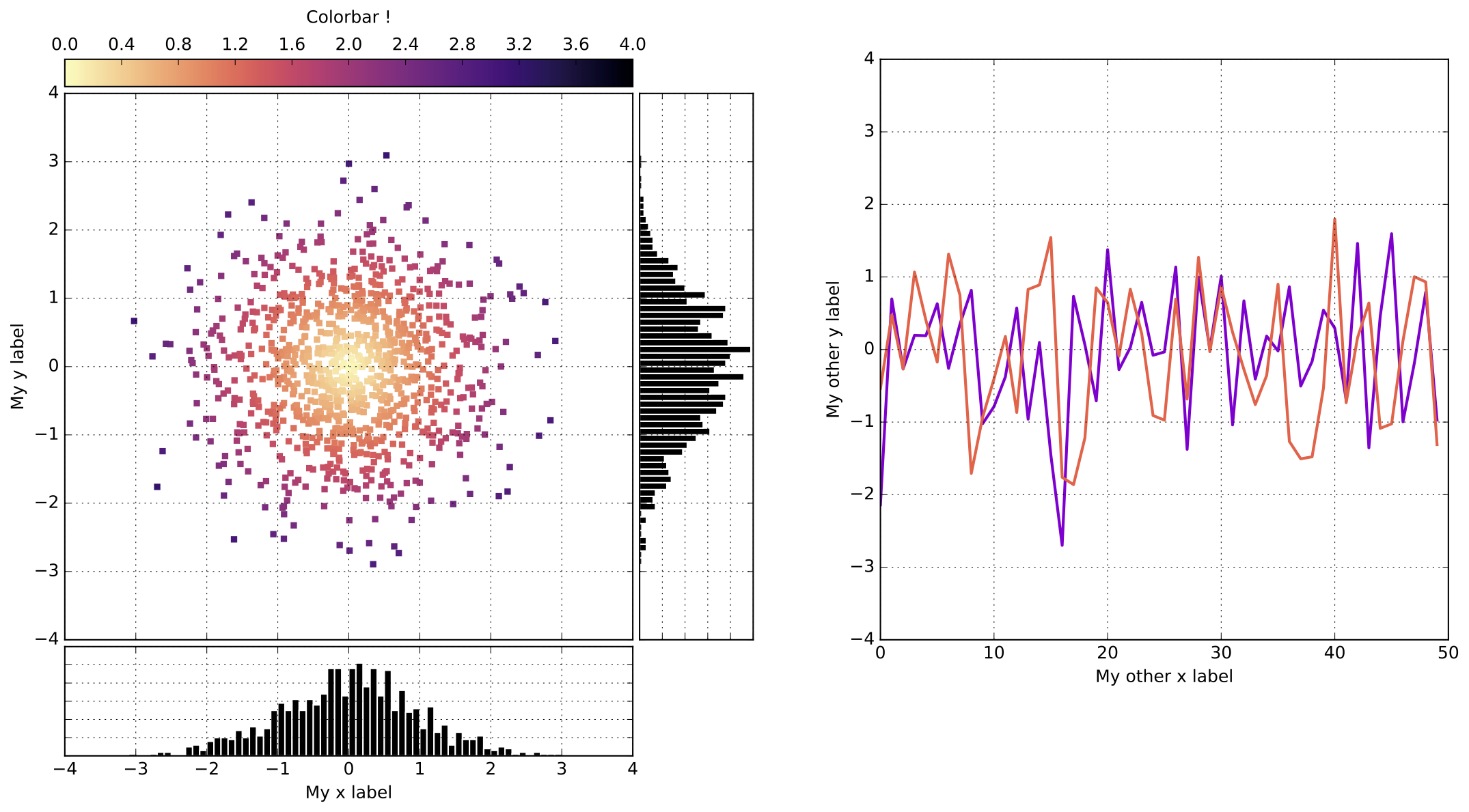
D-2) The scatter plot & colorbar
In [5]:
# First, the scatter plot
# Use the gridspec magic to place it
# --------------------------------------------------------
ax1 = plt.subplot(gs[1,0]) # place it where it should be.
# --------------------------------------------------------

# The plot itself
plt1 = ax1.scatter(x, y, c = z,
                   marker = 's', s=20, edgecolor = 'none',alpha =1,
                   cmap = 'magma_r', vmin =0 , vmax = 4)

# Define the limits, labels, ticks as required
ax1.grid(True)
ax1.set_xlim([-4,4])
ax1.set_ylim([-4,4])
ax1.set_xlabel(r' ') # Force this empty !
ax1.set_xticks(np.linspace(-4,4,9)) # Force this to what I want - for consistency with histogram below !
ax1.set_xticklabels([]) # Force this empty !
ax1.set_ylabel(r'My y label')

# and let us not forget the colorbar  above !
# --------------------------------------------------------
cbax = plt.subplot(gs[0,0]) # Place it where it should be.
# --------------------------------------------------------

cb = Colorbar(ax = cbax, mappable = plt1, orientation = 'horizontal', ticklocation = 'top')
cb.set_label(r'Colorbar !', labelpad=10)

fig.show()
D-3) The first histogram (vertical)
In [6]:
# NOTE: I guess that a kernel density plot on top of the histogram would be better from a scientific standpoint.
# But this is only meant as an illustration of a side-plot, so who cares ?

# And now the histogram
# Use the gridspec magic to place it
# --------------------------------------------------------
ax1v = plt.subplot(gs[1,1])
# --------------------------------------------------------


# Plot the data
bins = np.arange(-4,4,0.1)
ax1v.hist(y,bins=bins, orientation='horizontal', color='k', edgecolor='w')

# Define the limits, labels, ticks as required
ax1v.set_yticks(np.linspace(-4,4,9)) # Ensures we have the same ticks as the scatter plot !
ax1v.set_xticklabels([])
ax1v.set_yticklabels([])
ax1v.set_ylim([-4,4])
ax1v.grid(True)

fig.show()
D-4) The second histogram (horizontal)
In [7]:
# And now another histogram
# Use the gridspec magic to place it
# --------------------------------------------------------
ax1h = plt.subplot(gs[2,0])
# --------------------------------------------------------


# Plot the data
bins = np.arange(-4,4,0.1)
ax1h.hist(x, bins=bins, orientation='vertical', color='k', edgecolor='w')

# Define the limits, labels, ticks as required
ax1h.set_xticks(np.linspace(-4,4,9)) # Ensures we have the same ticks as the scatter plot !
ax1h.set_yticklabels([])
ax1h.set_xlim([-4,4])
ax1h.set_xlabel(r'My x label')
ax1h.grid(True)

fig.show()
D-5) The line plot
In [8]:
# Finally, show some 'spectra' in the right panel
# Use the gridspec magic to place it
# --------------------------------------------------------
ax2 = plt.subplot(gs[0:2,3]) # Make it span the entire height of the figure (3 rows)
# --------------------------------------------------------

# Plot the data
plt.plot(x[::20], ls = '-', color='darkviolet', lw=2)
plt.plot(y[::20], ls = '-', color ='tomato', lw=2)

# Define the limits, labels, ticks as required
ax2.set_xlabel('My other x label')
ax2.set_ylabel('My other y label')
ax2.set_ylim([-4,4])
ax2.grid(True)

fig.show()
D-6) Plot and save it all
In [9]:
# Save it and display it
fig.savefig('gridspec_demo.pdf', bbox_inches='tight')
# bbox_inches -> crops the extra space if any !

fig.show()
G) Python 2.7 vs Python 3.x. Thoughts ?
H) Gridspec & Jupyter notebooks (inline)
gridspec also works fine inside a jupyter notebook. The examples before used an external plot window for clarity during the setp-by-step construction process of the final plot. Below, you can get the same figure inside the notebook. Note that this will require to restart the kernel before running it.
In [8]:
import numpy as np # For creating some fake data

# Use some notebook magic - forget the next line in normal scripted code
%matplotlib inline

import matplotlib.pyplot as plt # Gives access to basic plotting functions
import matplotlib.gridspec as gridspec # GRIDSPEC !
from matplotlib.colorbar import Colorbar # For dealing with Colorbars the proper way - TBD in a separate PyCoffee ?

# Ok, let us start by creating some fake data
x = np.random.randn(1000)
y = np.random.randn(1000)
z = np.sqrt(x**2+y**2)

# `randn` generates an array of shape ``(d0, d1, ..., dn)``, filled
# with random floats sampled from a univariate "normal" (Gaussian)
# distribution of mean 0 and variance 1.


fig = plt.figure(1, figsize=(15,8))


# Now, create the gridspec structure, as required
gs = gridspec.GridSpec(3,4, height_ratios=[0.05,1,0.2], width_ratios=[1,0.2,0.2,1])

# 3 rows, 4 columns, each with the required size ratios.
# Also make sure the margins and spacing are apropriate

gs.update(left=0.05, right=0.95, bottom=0.08, top=0.93, wspace=0.02, hspace=0.03)

# Note: I set the margins to make it look good on my screen ...
# BUT: this is irrelevant for the saved image, if using bbox_inches='tight'in savefig !

# Note: Here, I use a little trick. I only have three vertical layers of plots :
# a scatter plot, a histogram, and a line plot. So, in principle, I could use a 3x3 structure.
# However, I want to have the histogram 'closer' from the scatter plot than the line plot.
# So, I insert a 4th layer between the histogram and line plot,
# keep it empty, and use its thickness (the 0.2 above) to adjust the space as required.

# First, the scatter plot
# Use the gridspec magic to place it
# --------------------------------------------------------
ax1 = plt.subplot(gs[1,0]) # place it where it should be.
# --------------------------------------------------------

# The plot itself
plt1 = ax1.scatter(x, y, c = z,
                   marker = 's', s=20, edgecolor = 'none',alpha =1,
                   cmap = 'magma_r', vmin =0 , vmax = 4)

# Define the limits, labels, ticks as required
ax1.grid(True)
ax1.set_xlim([-4,4])
ax1.set_ylim([-4,4])
ax1.set_xlabel(r' ') # Force this empty !
ax1.set_xticks(np.linspace(-4,4,9)) # Force this to what I want - for consistency with histogram below !
ax1.set_xticklabels([]) # Force this empty !
ax1.set_ylabel(r'My y label')

# and let us not forget the colorbar  above !
# --------------------------------------------------------
cbax = plt.subplot(gs[0,0]) # Place it where it should be.
# --------------------------------------------------------

cb = Colorbar(ax = cbax, mappable = plt1, orientation = 'horizontal', ticklocation = 'top')
cb.set_label(r'Colorbar !', labelpad=10)

# NOTE: I guess that a kernel density plot on top of the histogram would be better from a scientific standpoint.
# But this is only meant as an illustration of a side-plot, so who cares ?

# And now the histogram
# Use the gridspec magic to place it
# --------------------------------------------------------
ax1v = plt.subplot(gs[1,1])
# --------------------------------------------------------


# Plot the data
bins = np.arange(-4,4,0.1)
ax1v.hist(y,bins=bins, orientation='horizontal', color='k', edgecolor='w')

# Define the limits, labels, ticks as required
ax1v.set_yticks(np.linspace(-4,4,9)) # Ensures we have the same ticks as the scatter plot !
ax1v.set_xticklabels([])
ax1v.set_yticklabels([])
ax1v.set_ylim([-4,4])
ax1v.grid(True)

# And now another histogram
# Use the gridspec magic to place it
# --------------------------------------------------------
ax1h = plt.subplot(gs[2,0])
# --------------------------------------------------------


# Plot the data
bins = np.arange(-4,4,0.1)
ax1h.hist(x, bins=bins, orientation='vertical', color='k', edgecolor='w')

# Define the limits, labels, ticks as required
ax1h.set_xticks(np.linspace(-4,4,9)) # Ensures we have the same ticks as the scatter plot !
ax1h.set_yticklabels([])
ax1h.set_xlim([-4,4])
ax1h.set_xlabel(r'My x label')
ax1h.grid(True)

# Finally, show some 'spectra' in the right panel
# Use the gridspec magic to place it
# --------------------------------------------------------
ax2 = plt.subplot(gs[0:2,3]) # Make it span the entire height of the figure (3 rows)
# --------------------------------------------------------

# Plot the data
plt.plot(x[::20], ls = '-', color='darkviolet', lw=2)
plt.plot(y[::20], ls = '-', color ='tomato', lw=2)

# Define the limits, labels, ticks as required
ax2.set_xlabel('My other x label')
ax2.set_ylabel('My other y label')
ax2.set_ylim([-4,4])
ax2.grid(True)

In [ ]: